Introducing the Spacelia Logo: A Symbol for a Free Digital Space Nation
Introducing the Spacelia Logo: A Symbol for a Free Digital Space Nation
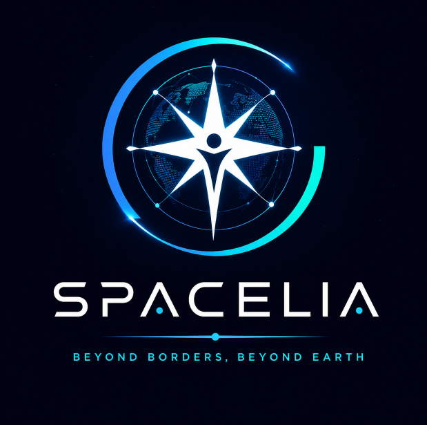
The Spacelia logo is more than just a mark — it is a compact symbol of who we are as a free digital nation of space. It blends the language of astronomy, technology, and community into a single, simple sign that can live anywhere: on your citizen card, your digital passport, your profile, and one day, even in orbit.
At the center of the logo is a bright core, representing every individual citizen. It is a reminder that Spacelia is built around people, not territory: one human, one identity, one voice. Around this core, an orbit forms a clean, circular path, echoing the trajectories of planets and satellites in space. This orbit is a metaphor for our shared journey — millions of lives moving together around a common future, balanced but always in motion.
The outer glow and gradient reflect the dawn of a new digital era. The transition from deep space tones to vibrant cyan and green symbolizes progress: from darkness and fragmentation toward connection, knowledge, and hope. Our choice of a modern, geometric typeface for the SPACELIA wordmark connects us to the world of technology and space programs, where precision and clarity matter. It is designed to feel solid and trustworthy, yet light enough to belong to the infinite night sky.
The circular form of the logo also speaks to equality. There is no top or bottom, no center of power above others — just a shared ring that every citizen belongs to. No matter where you live on Earth, the same emblem, the same citizenship, and the same digital rights apply. This mirrors the idea behind other space nations that use circles, orbits, and solar symbols to represent unity beyond borders, but Spacelia’s mark focuses on openness and accessibility first.
In practice, the logo is designed to be flexible. It works as a tiny icon on your browser tab, as a glowing emblem on your digital citizen card, or as a large symbol on banners, websites, and future physical missions. On dark backgrounds, the logo feels like a star or station hanging in space. On light backgrounds, it becomes a clear technological seal, ready to be stamped on documents, apps, and identity tools.
Most importantly, the Spacelia logo belongs to you — the citizens. Every time you see it on your profile, your blog, or your card, it is a quiet promise: that your digital identity matters, that you are part of something bigger than any single platform, and that the future of space should remain open, peaceful, and free. This is not just a logo for a website. It is the emblem of a living,
By Reza (admin@spacelia.ir)
Comments
Add a Comment
Please login to comment.
f
By Neda